Year: 2020-2022
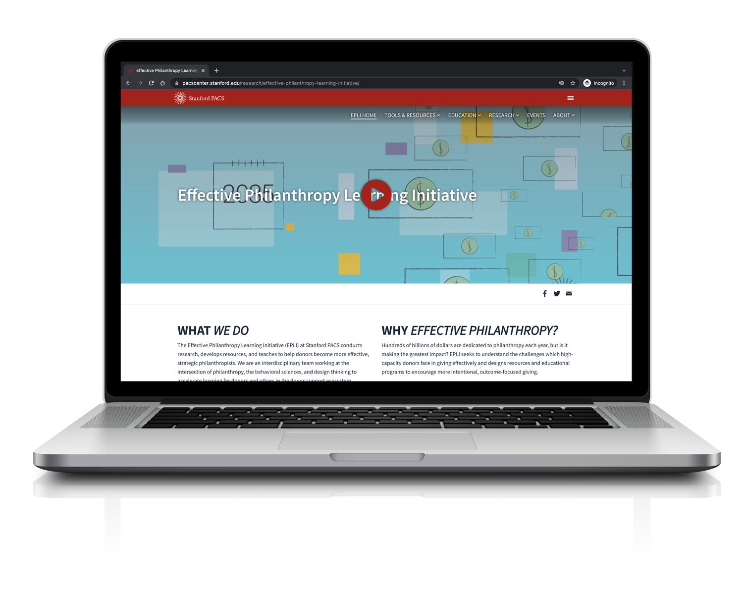
My first project at the Stanford Effective learning Initiative was leading the complete overhaul, and redesign of their website.
The previous website did not reflect the scholarly work being produced by the lab. Beyond that their publications on Effective Philanthropy needed to be translated into intuitive, and immersive online learning experiences.
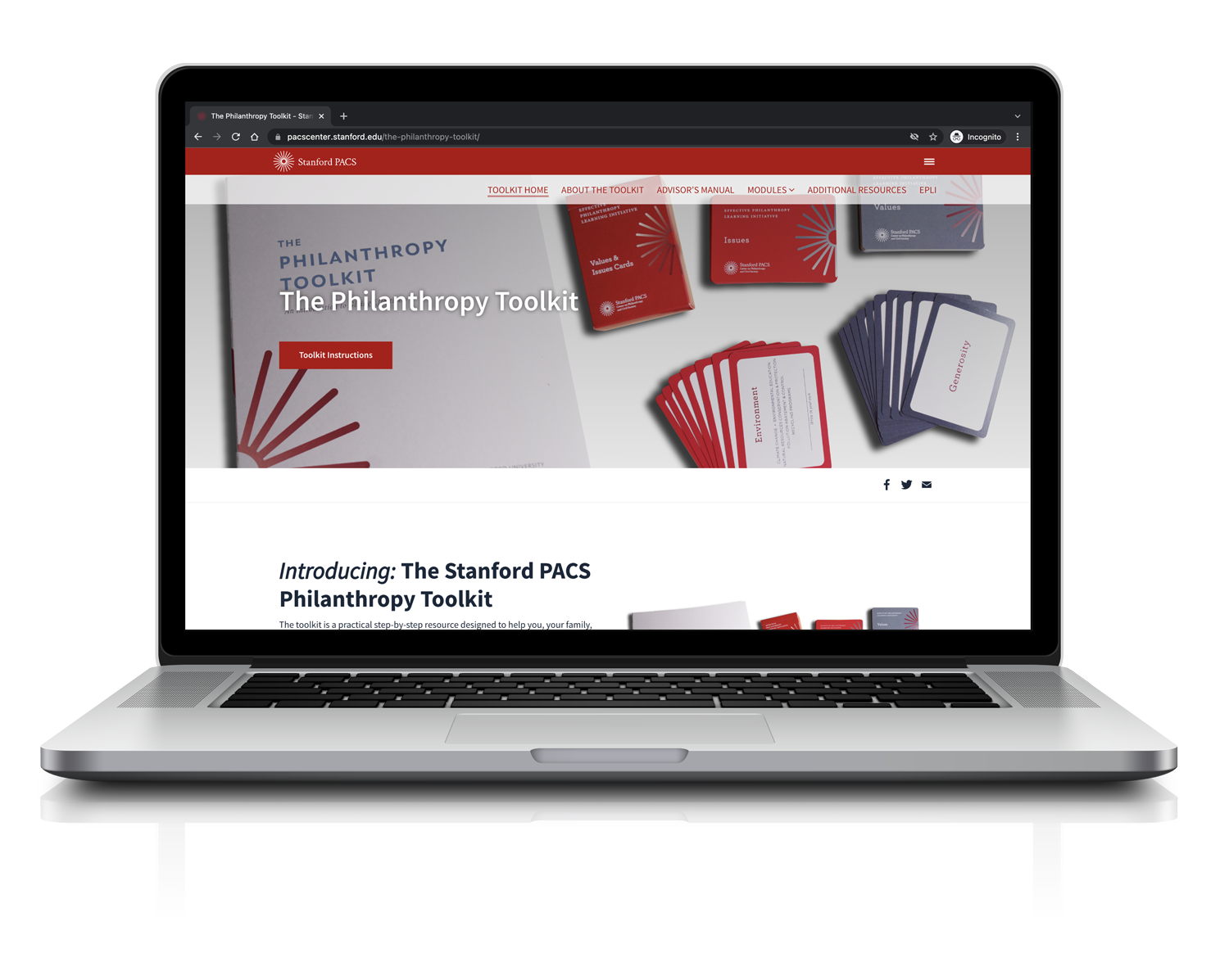
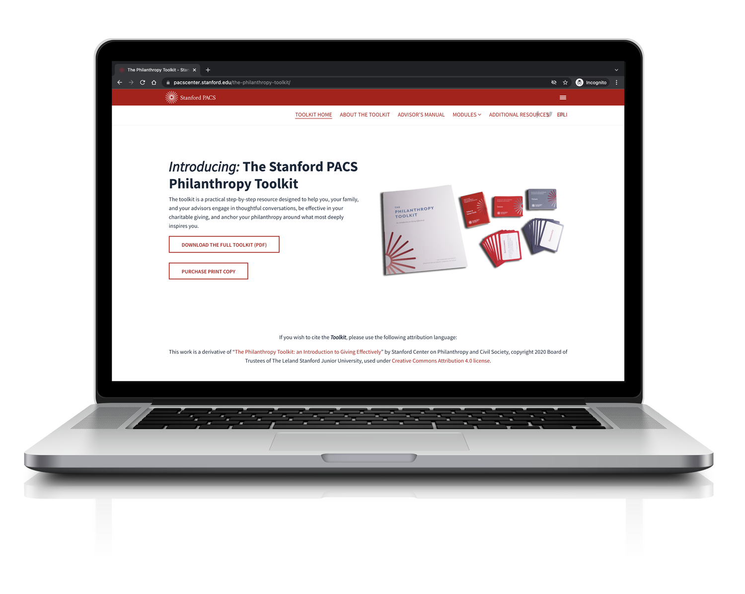
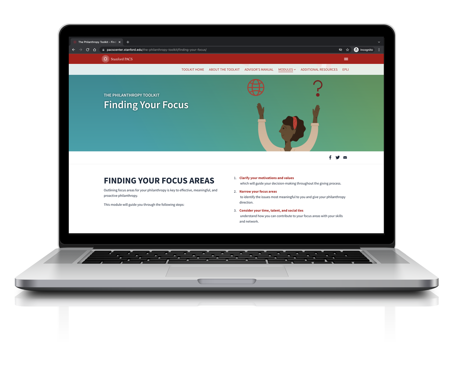
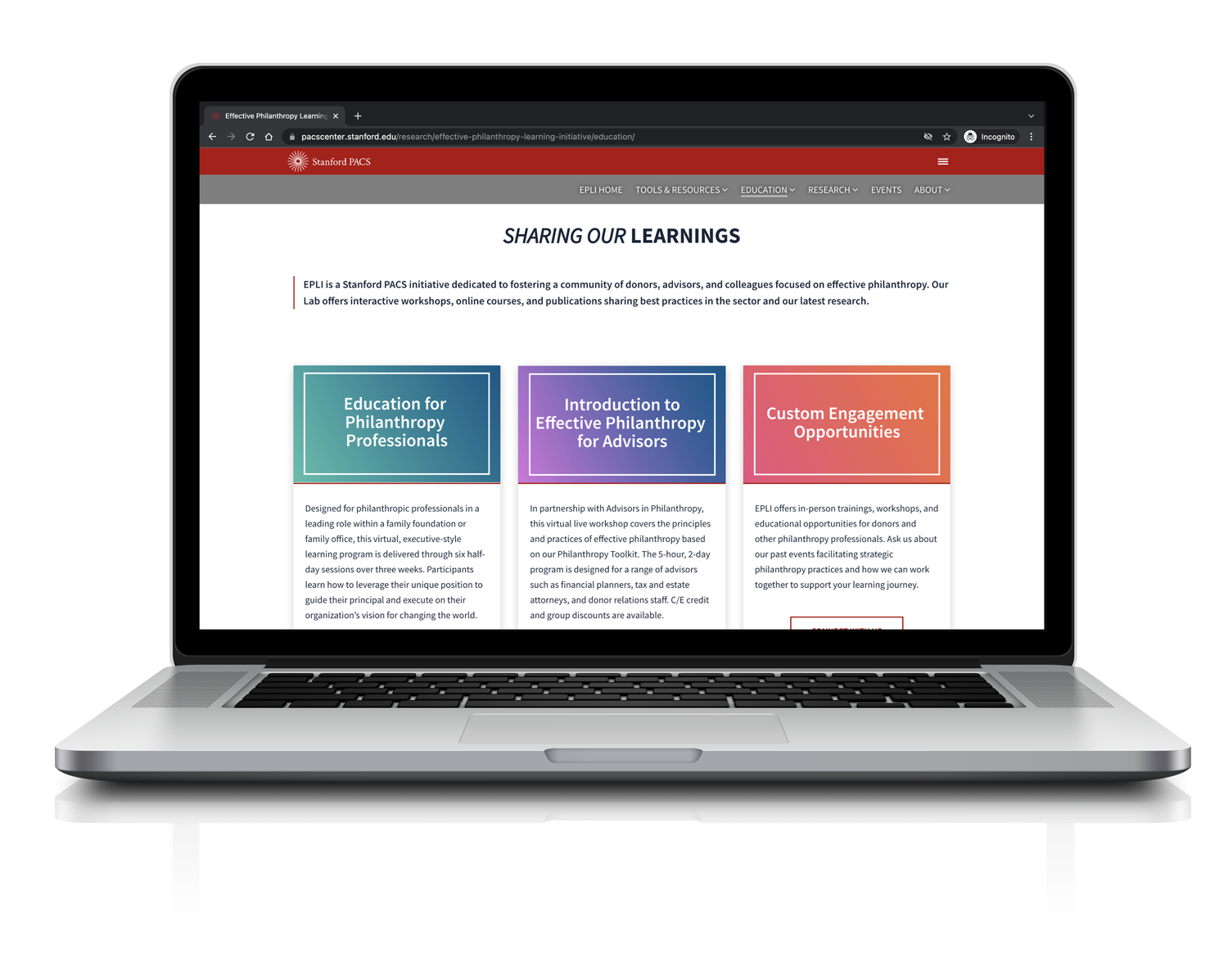
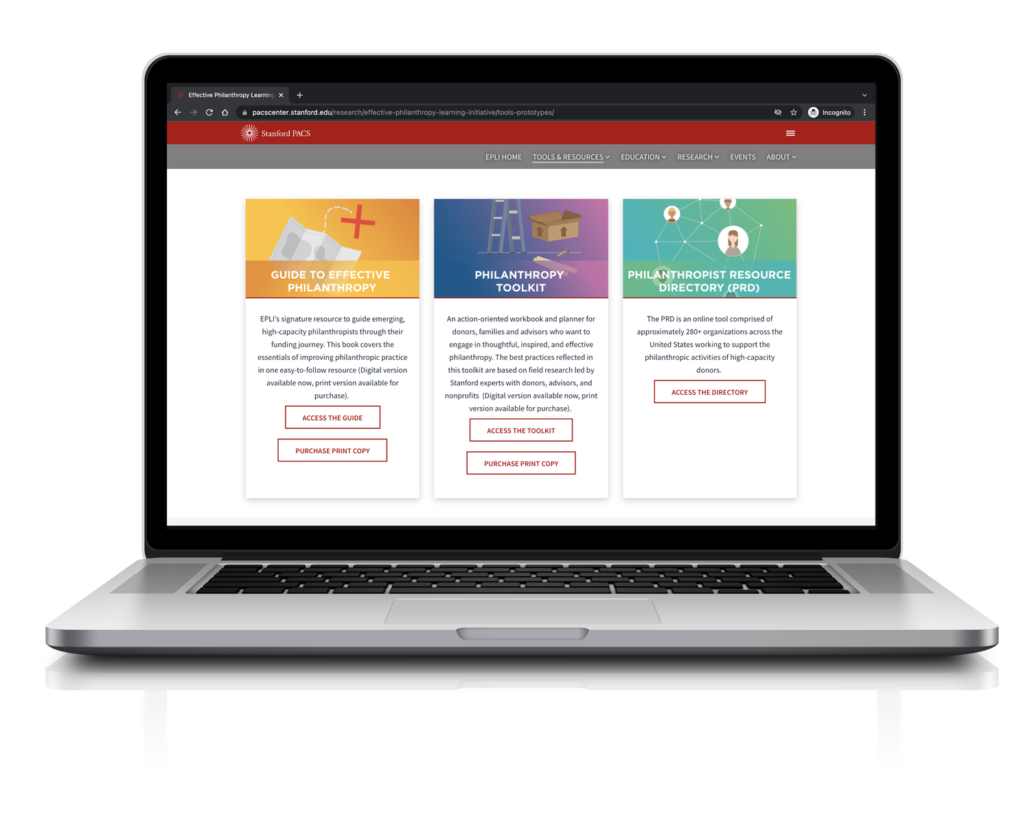
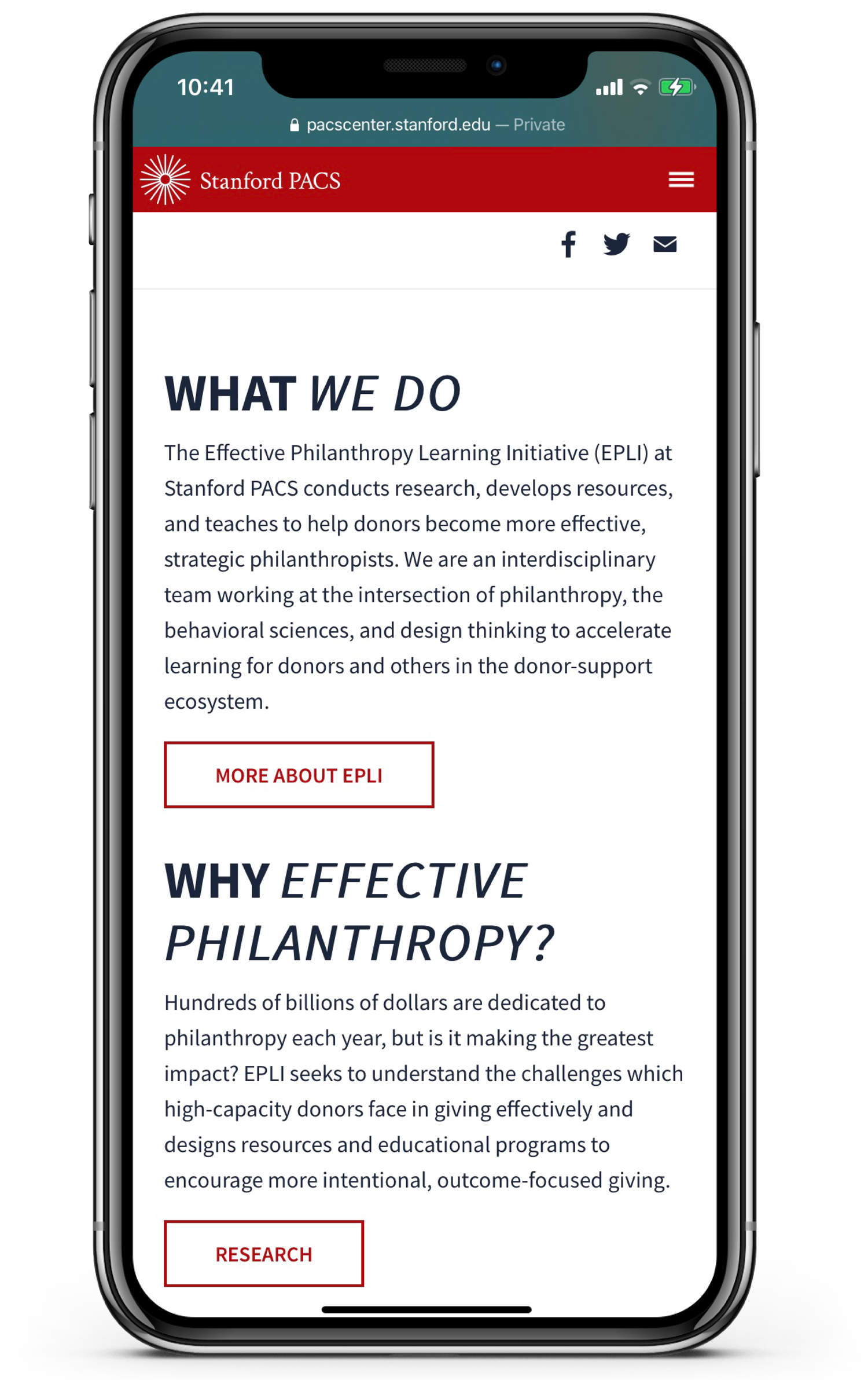
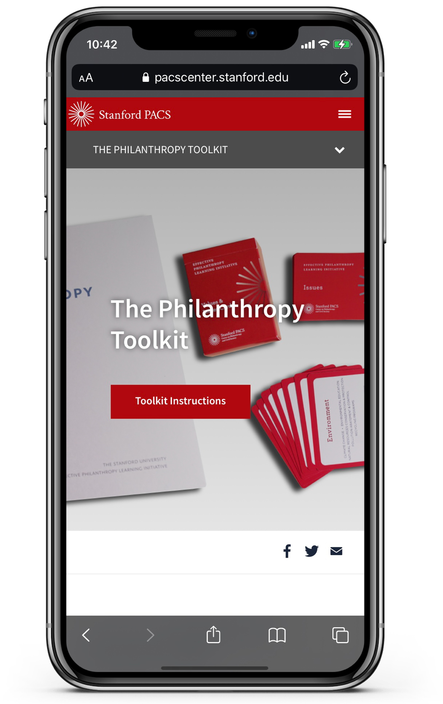
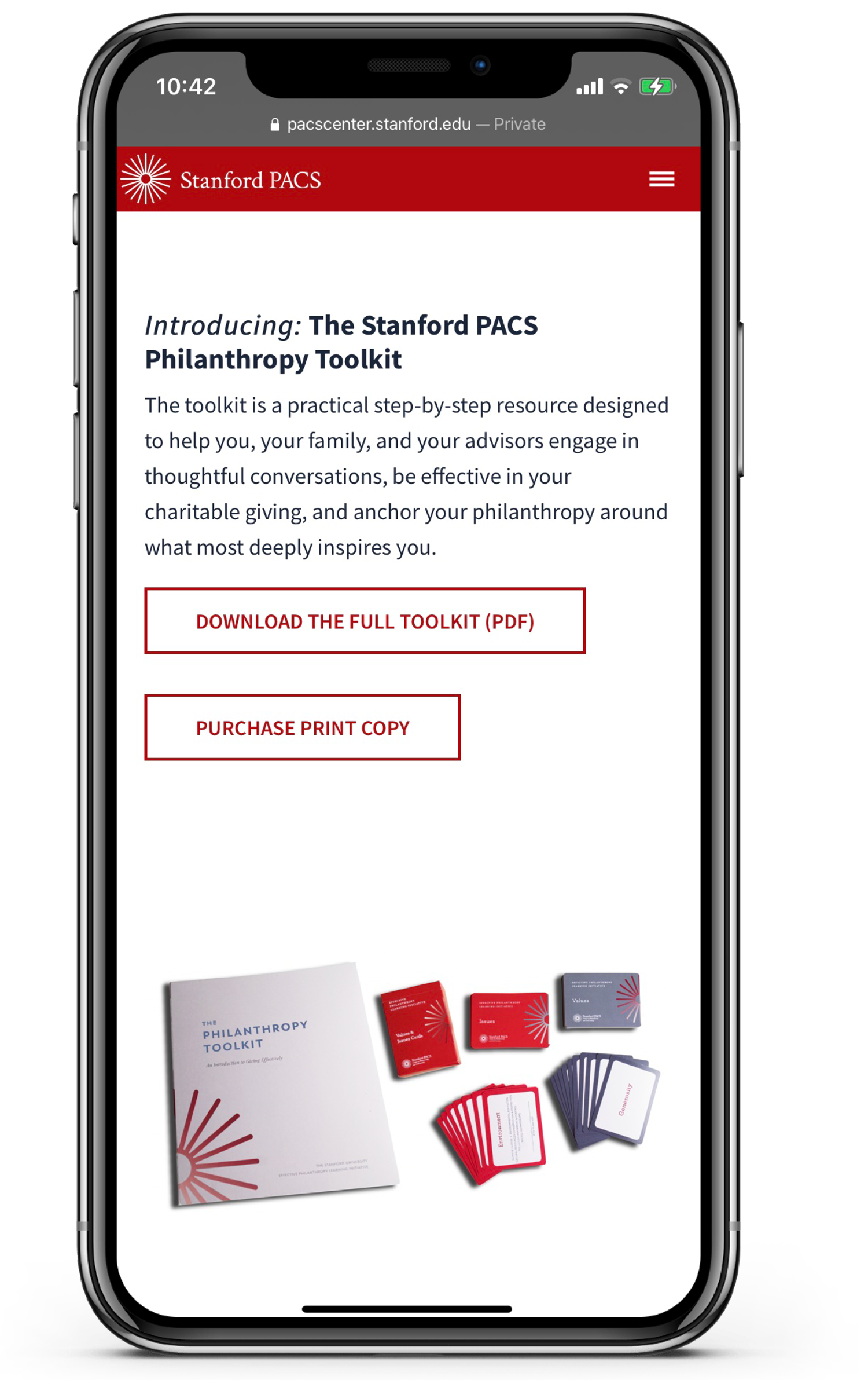
The solution was a complete website overhaul starting with the site hierarchy, and ending with a completely new style guide I specifically developed for the EPLI team to help define us as a lab at the Stanford Philanthropy and Civil Society Program. Beyond that we also decided that it would be best to develop an online learning experience for the two publications the lab published.
The initial website was very text heavy, and had outdated visuals. The navigation was complex, and it was confusing to the user what things were actually clickable vs graphics.
To gain a better understanding of what wasn't working and what our users would like to see, we spent some time user testing the site in its current state. I asked handful of clients, advisors, and coworkers from the program to run through various user scenarios. Many of which were unable to complete the tasks given to them.
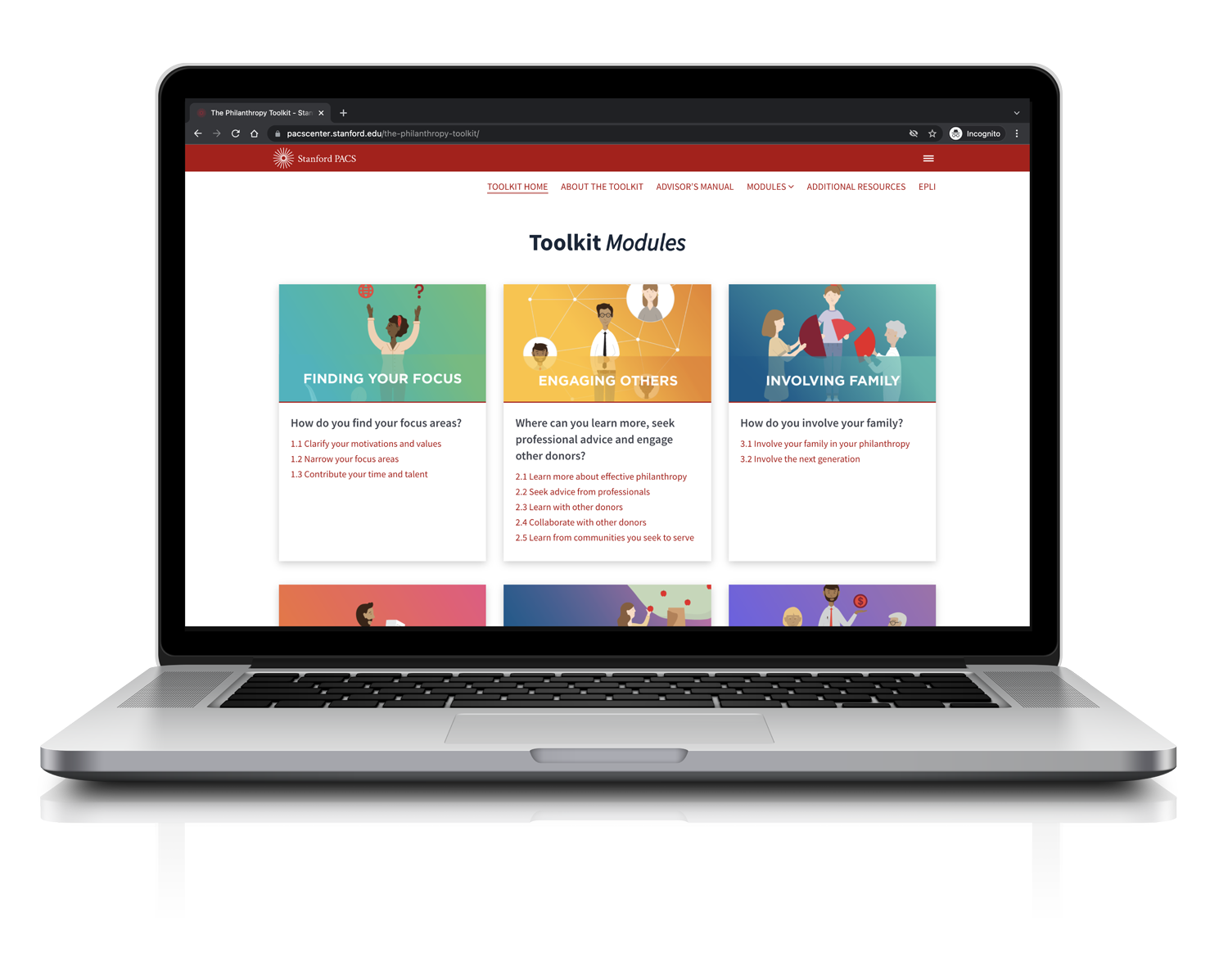
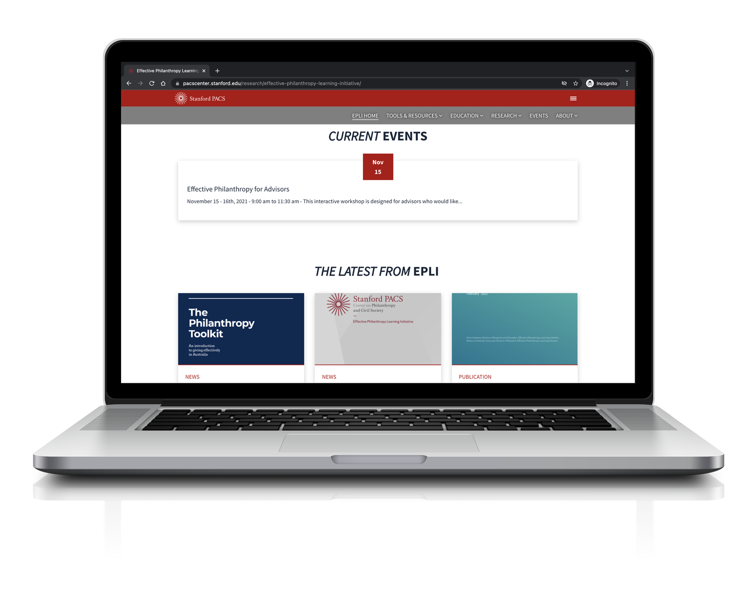
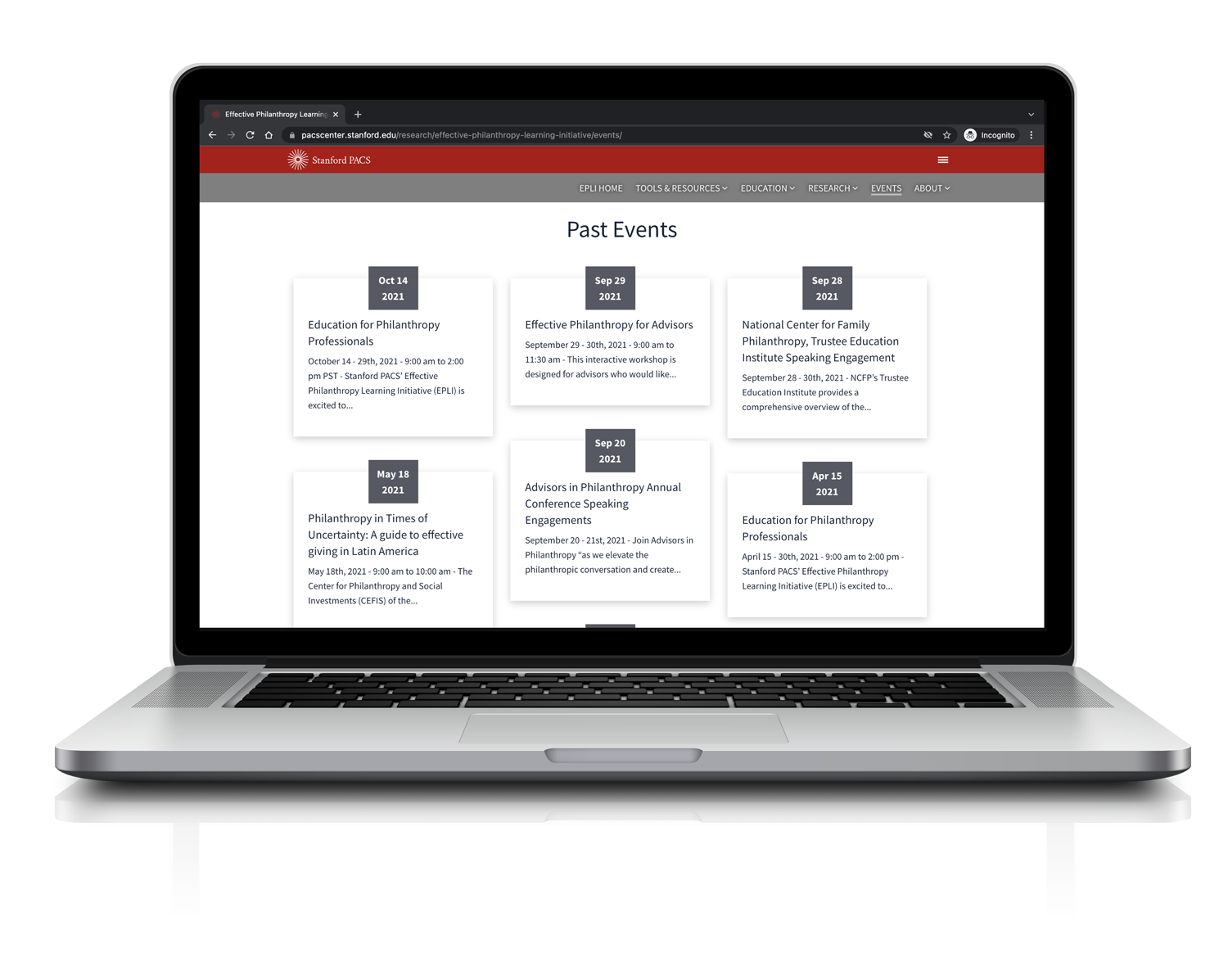
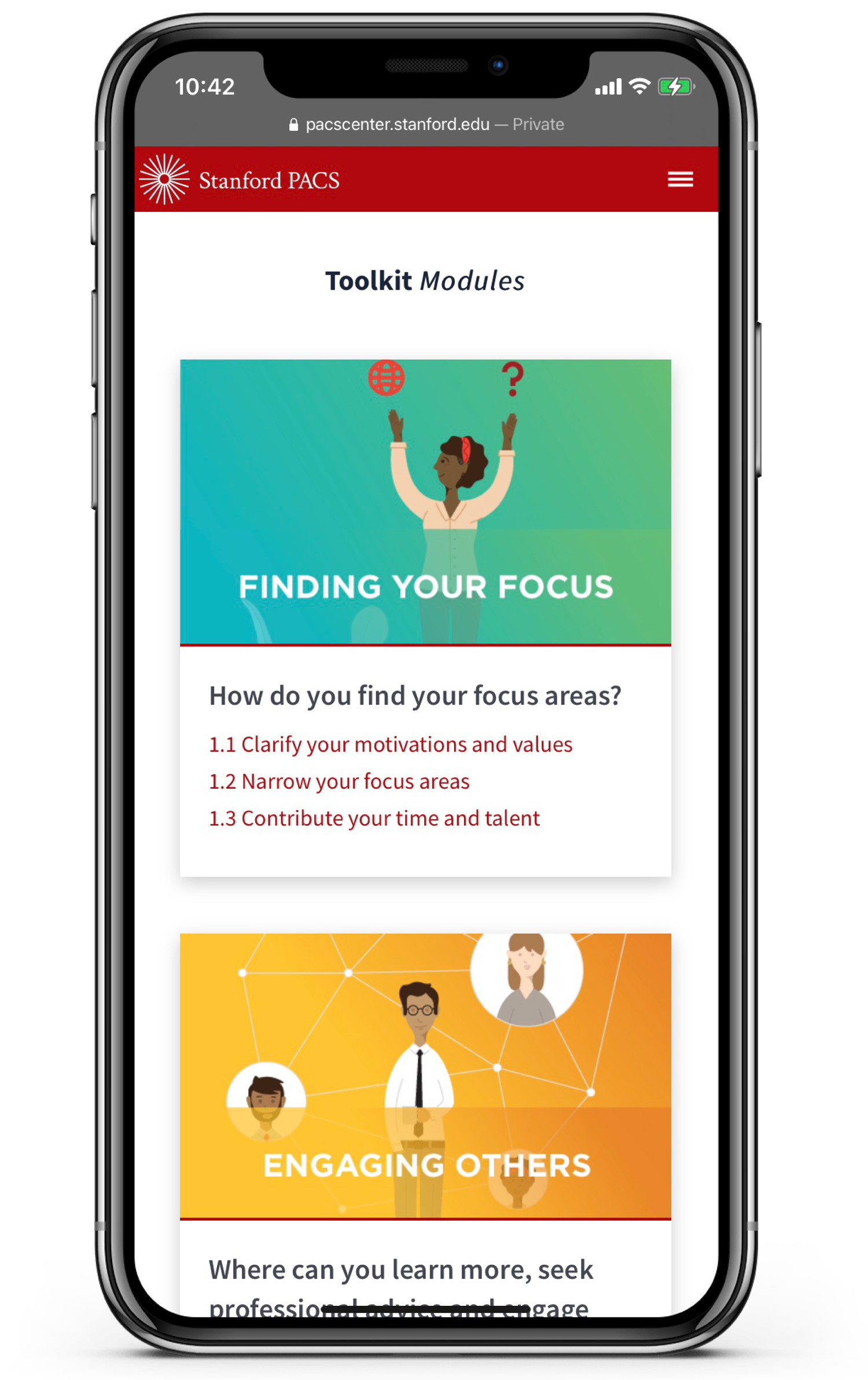
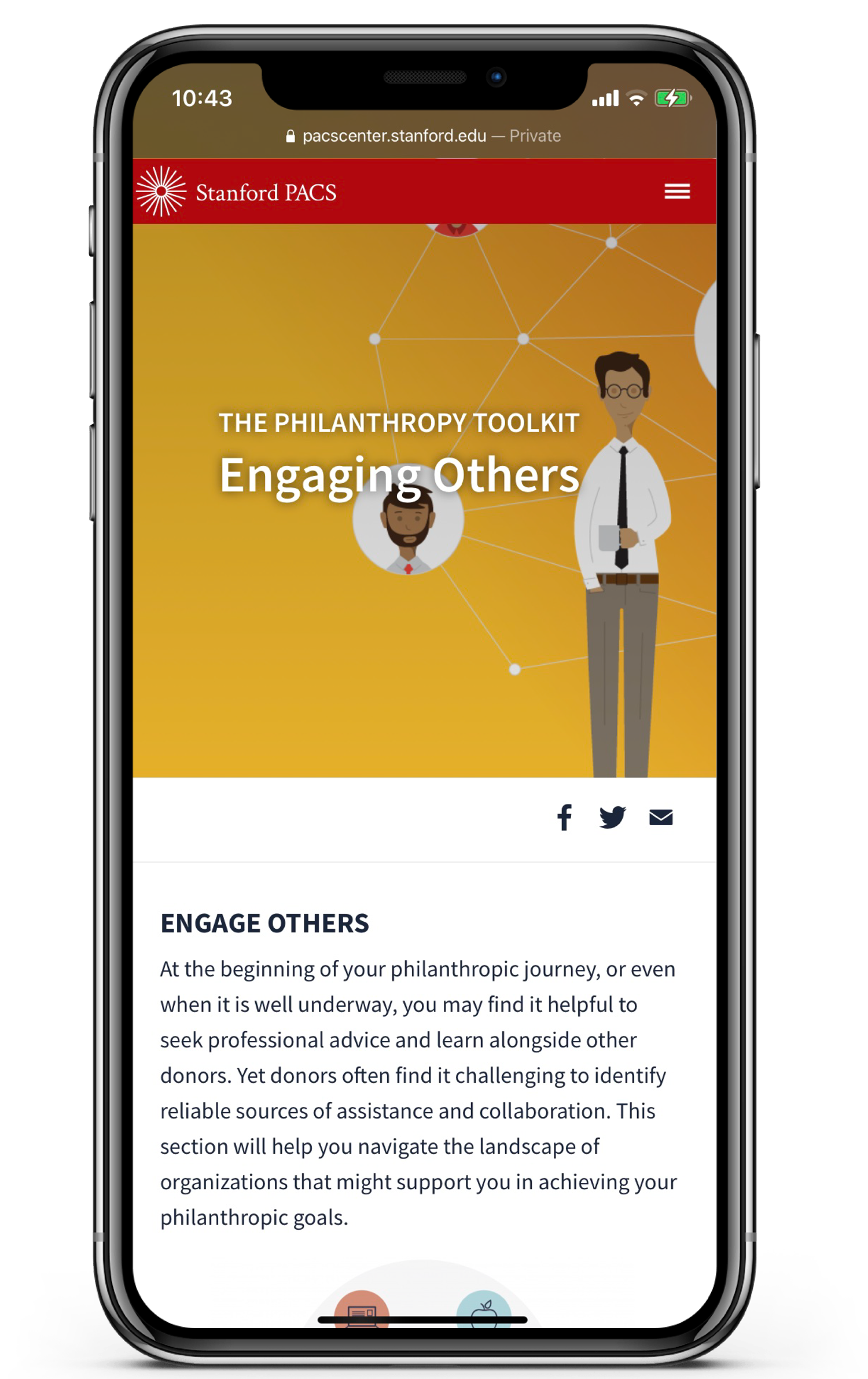
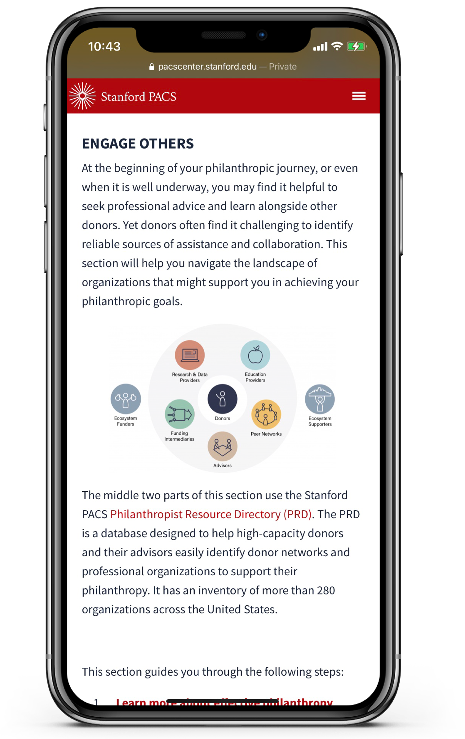
After the issue of navigation was resolved we were able to approach the content. Being that we are a research, and education lab we have a lot of dense content that needs to be displayed in an elegant, and digestible way.
Once we better understood how to display, and break up the content we wanted to start to explore different ways we could interactively show our content. Part of the approach involved understanding how we would identify the difference between our Advisor facing content vs. our Donor facing content. Beyond that we also wanted to explore new and interactive ways to have our two print publications live online.
In conclusion we discovered that our main pain points were site navigation, and content digestibility. By redefining the site hierarchy we allowed our users to navigate our extensive content with as little friction as possible. We also decided to rebrand, and completely overhauled the visual look, and aesthetic of the site.